Featured Works
Explore our most impactful projects that showcase our expertise in delivering exceptional digital solutions.

Delivered high-quality features on time with exceptional attention to detail—becoming a reliable offshore extension that the client could truly depend on.
VetIT is a comprehensive veterinary practice management system built for the UK market. Madison Technologies partnered with VetIT to deliver Project Five—a major feature expansion requiring skilled engineering and rigorous quality assurance. Our team integrated seamlessly into their existing workflows, actively participated in ceremonies, and quickly built strong working relationships. The collaboration felt like a natural extension of their internal team rather than an external vendor, with clear communication ensuring alignment across time zones and stakeholders.

Powered real-time GPS tracking for 20M registered users with < 2s response time—delivering national-scale reliability and security at just $700/month all-in.
CovCT is a government-grade digital platform built to track real-time GPS location for millions of users under strict public-sector data protection requirements. We engineered the system to consistently deliver sub-2-second responses while operating on extremely constrained infrastructure budgets. Over two years in production, the platform supported deployments for multiple governments across APAC and Europe, remained resilient through multiple DDoS attempts, and recorded no reported security incidents throughout operations.

A unified enterprise data platform built on GCP + BigQuery and microservices—enabling real-time visibility, advanced analytics, and an AI-ready foundation that supported successful commercialization across Gamuda's digital construction ecosystem.
GDOS (Gamuda Digital Operating System) is Gamuda Group's unified digital platform that consolidates enterprise, project, and engineering data into a single ecosystem—enabling real-time visibility, analytics, and data-driven decision-making across construction, engineering, supply chain, and financial operations. Madison Technologies partnered closely with Gamuda to design, implement, and integrate key GDOS components—ensuring the platform can handle large-scale project data, integrate systems such as BIM platforms, SAP S/4HANA, and Autodesk Construction Cloud, and support advanced analytics and GenAI initiatives. GDOS serves as a standardized operating environment underpinning Gamuda's digital transformation across business functions—and has since been successfully commercialized for production use at scale.

An all-in-one SaaS platform powered by agent workflows + Agentic RAG to automate SEO, content creation, and multi-channel publishing—so teams can ship smarter marketing, faster.
Fiore is a comprehensive marketing SaaS platform built for businesses that need one unified tool to streamline digital marketing. It began as an auto-article generator and evolved into an end-to-end system that supports sign-up, subscriptions, integrations (social, email, CMS, analytics), and automated content operations. Powered by agent workflows and Agentic RAG, Fiore generates, optimizes, and manages content across blog articles, email campaigns, and social media—helping teams increase velocity while keeping quality, relevance, and consistency high.

Scaled and stabilized a consumer payments platform across 4 APAC markets, enabling faster regional rollout with reliable payment operations and high adoption.
Fave is a smart payment app operating across Malaysia, Singapore, Indonesia, and India. Our delivery teams supported market expansion and cross-region reliability by extending core payment capabilities, strengthening backend services for Payments, e-Cards, and Cashback, and raising release quality through CI/CD and automated testing—supporting growth momentum as Pine Labs (parent company) progressed toward a successful public listing.

An interactive, browser-based learning game built for a global payments brand—combining Unity WebGL gameplay with React UX, validated by usability testing, and instrumented end-to-end for measurable engagement.
We delivered a web-based financial literacy demo game for a globally recognized payments brand, designed to make everyday money decisions feel tangible through gameplay. Players progress through scenario questions while balancing Health, Money, and Happiness, turning abstract trade-offs into clear outcomes. The experience is fully launched and shaped through rapid usability testing to refine clarity and flow—resulting in a smooth, high-quality product that earned strong user feedback and provides measurable insights through analytics instrumentation.
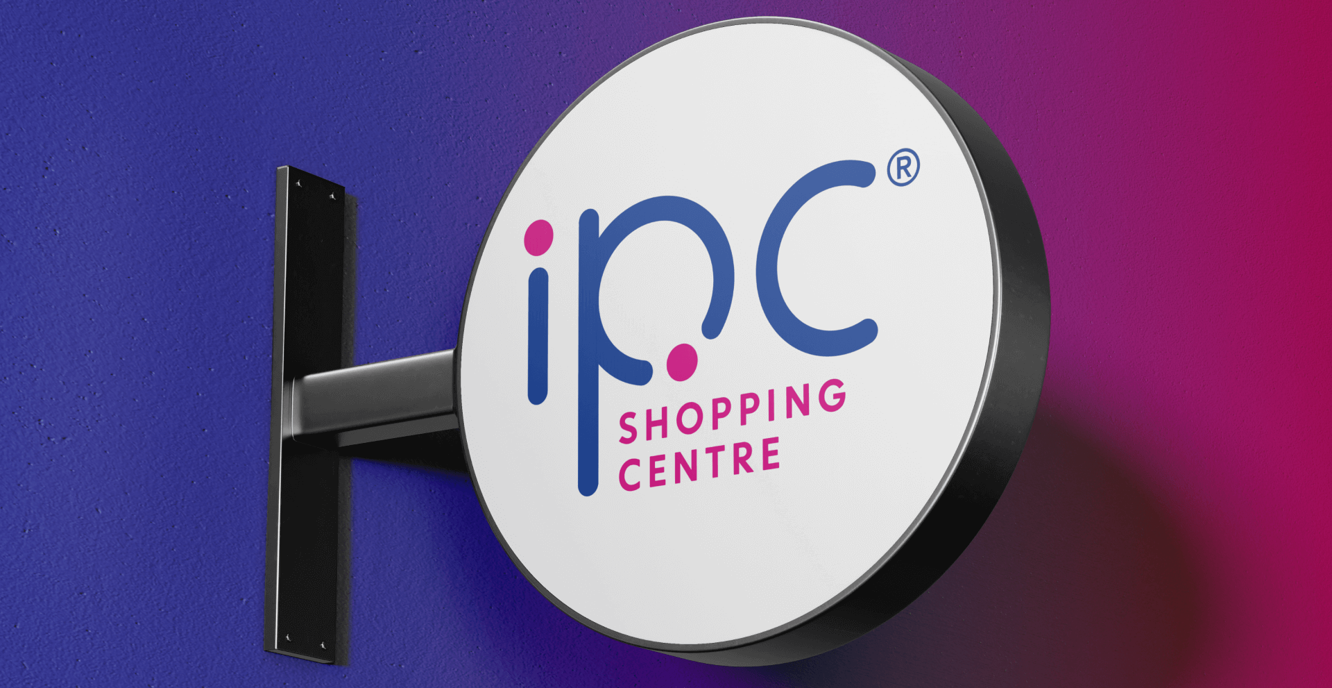
A true shopping companion experience—redesigned end-to-end to boost engagement, rewards participation, and on-site convenience through a reliable, high-traffic platform.
IPC aimed to create a "true shopping companion" app—one place where members can earn and redeem rewards, access mall services, and stay engaged beyond promotions. We led a full revamp across mobile, backend, and web, delivering a high-reliability super-app that connects loyalty (Tack Points), RBBC (Recycling & Buy-Back Centre) participation, gamification, parking-related integrations, and a full-featured EV charging experience.
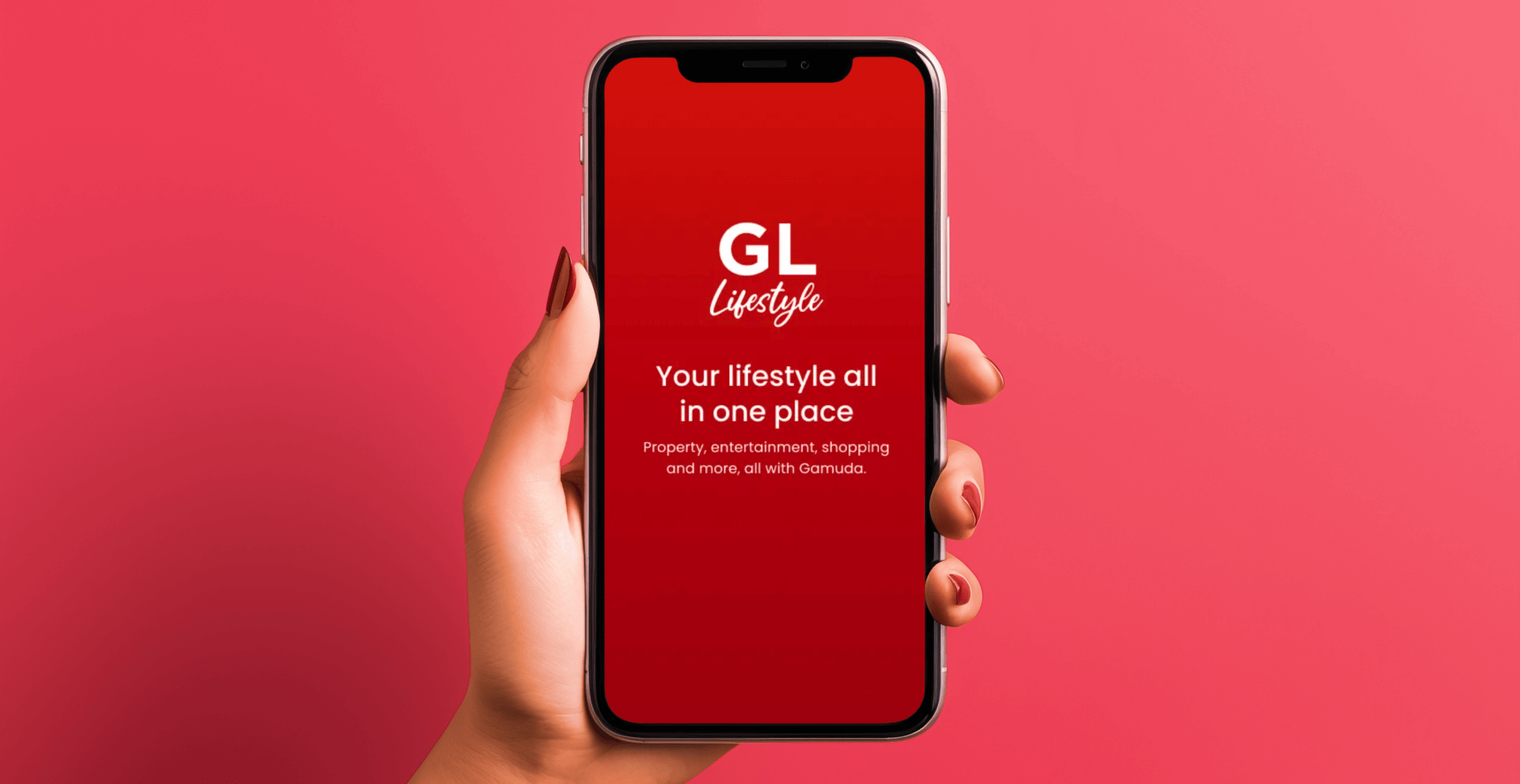
A modernized, AI-ready township ecosystem across customer super app, admin portal, and guard app—rebuilt on microservices and Google Cloud for scale, reliability, and future rollouts.
GL Lifestyle+ is Gamuda Land's digital lifestyle platform designed to serve residents, visitors, and on-ground operations across its townships. Madison Technologies led the end-to-end revamp of the ecosystem—modernizing the customer super app, administrative portal, and guard application into a unified product experience with consistent journeys, interfaces, and system interactions. The new platform improves usability for everyday residents and operational teams, streamlines fragmented estate workflows, and establishes a scalable foundation for continuous feature expansion. The MVP successfully went live in November 2025, enabling real-world validation and iterative improvement beyond the legacy GL Lifestyle app.

Built an AI-driven logistics platform that automates manual operations and optimizes shipment journeys—helping enterprise teams move faster, cut costs, and scale globally.
Quincus is a Singapore-headquartered logistics and supply chain technology company with a global presence, helping enterprises modernize operations beyond traditional logistics workflows. We contributed to building and scaling modular products that automate manual tasks and apply AI and analytics to optimize shipment planning and execution—improving reliability, speed, and decision-making across complex supply chain networks.
How We Work Together
Choose from flexible engagement models tailored to your project needs, or explore partnership opportunities to grow and innovate alongside us.
Time & Material
Flexible billing based on actual hours worked. Ideal for evolving projects.
Dedicated Resources
Your own team of experts working exclusively on your project.
Design Thinking Workshop
Collaborative sessions to validate ideas and define product strategy.
Ecosystem Rewards
Earn rewards by referring clients to Madison Technologies.
Co-Innovation & Ventures
Co-create and co-invest in innovative digital products together.


